
Common Mistakes When Choosing Paint Colors and How to Avoid Them


Understanding the Importance of Color Choice
Choosing the right paint color for your home can be an exciting yet daunting task. The color of your walls sets the tone for your entire space and can significantly impact the overall mood and feel of a room. Yet, many people fall into common pitfalls when selecting paint colors, leading to results that don't quite hit the mark. In this blog post, we'll explore some of these mistakes and offer tips on how to avoid them, ensuring that your home looks cohesive and inviting.
Overlooking Lighting Conditions
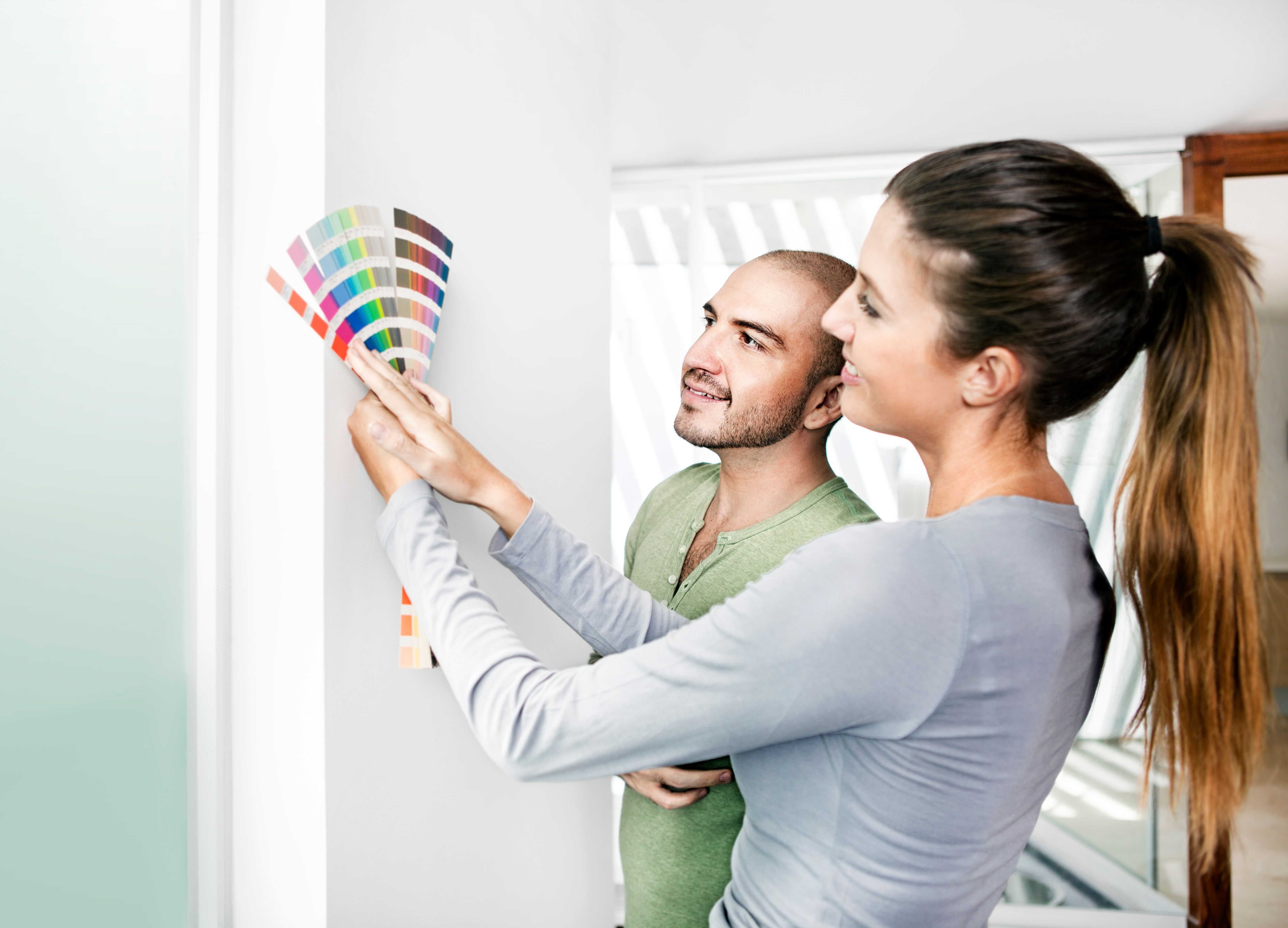
One of the most frequent mistakes people make is not considering how lighting affects paint colors. Natural and artificial lighting can dramatically change how a color appears in your space. A color that looks perfect in the store might appear completely different under your home’s lighting conditions. Before making a final decision, it's wise to test paint samples on your walls and observe them at different times of the day.
How to Test Colors
Paint a small section of your wall with the chosen sample and live with it for at least a week. This allows you to see how it looks in various lighting situations. Additionally, using large sample boards can be helpful as they can be moved around to different areas of the room.
Ignoring the Room’s Purpose
The function of a room should influence your color choice. For instance, soothing and muted tones are often ideal for bedrooms, where relaxation is key, while brighter colors might be better suited for a lively kitchen or playroom. Ignoring this aspect can lead to spaces that feel discordant or uncomfortable.
Tailoring Colors to Activities
Consider what activities take place in each room and choose colors that complement those activities. A study room might benefit from calming blues or greens that promote focus, while a dining room could shine with warm, inviting hues like terracotta or deep reds.
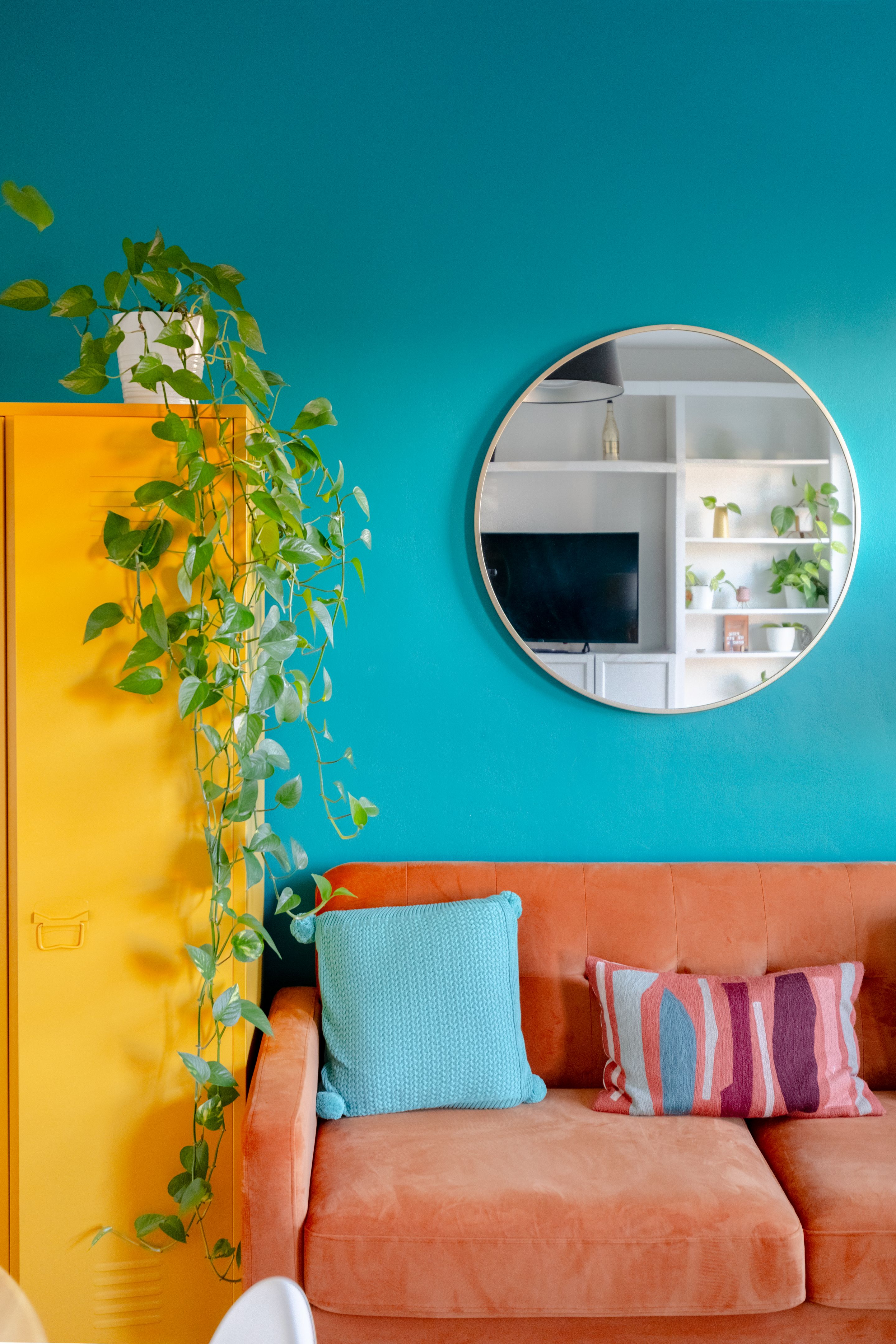
Relying Solely on Trends
While it can be tempting to choose colors that are currently in vogue, trends come and go. A color that's popular now may soon feel outdated, leaving you with the urge to repaint sooner than anticipated. Instead, aim for timeless hues that resonate with your personal style and complement your home’s architecture.
Balancing Trends with Timelessness
If you want to incorporate trendy colors, consider using them as accents rather than on large surfaces. This way, you can easily update the look of your room without a complete overhaul as trends evolve.
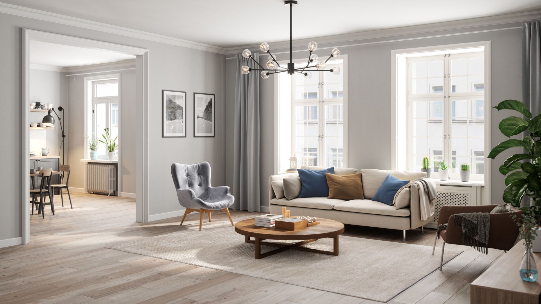
Forgetting to Coordinate with Existing Elements
Another common mistake is selecting paint colors without considering existing furnishings, flooring, and fixtures. A paint color that clashes with your furniture or flooring can make the entire room feel disjointed.
Creating a Cohesive Palette
To avoid this, create a mood board incorporating swatches of your current elements alongside potential paint colors. This visual representation can help ensure all components of your design scheme work harmoniously together.

Conclusion: Making the Right Choice
Choosing paint colors doesn't have to be overwhelming if you keep these common mistakes in mind and take proactive steps to avoid them. Remember that the right shade can enhance your space’s beauty and functionality, providing you with an environment that truly feels like home. By considering factors like lighting, room purpose, and existing decor, you can select colors that not only look great but also stand the test of time.