
Expert Advice: Common Mistakes When Choosing Paint Colors and How to Avoid Them


Understanding the Impact of Light
One of the most common mistakes when choosing paint colors is underestimating the influence of lighting. The same shade can look entirely different in natural light versus artificial light, or even from one room to another. It's crucial to observe how a paint sample appears at various times of the day and under different lighting conditions.

How to Test Colors Effectively
Before committing to a color, always test it on your walls. Paint small sections in different areas of the room to observe how the color changes throughout the day. This testing phase can save you from costly mistakes and ensure that the final result meets your expectations.
Avoiding Color Overload
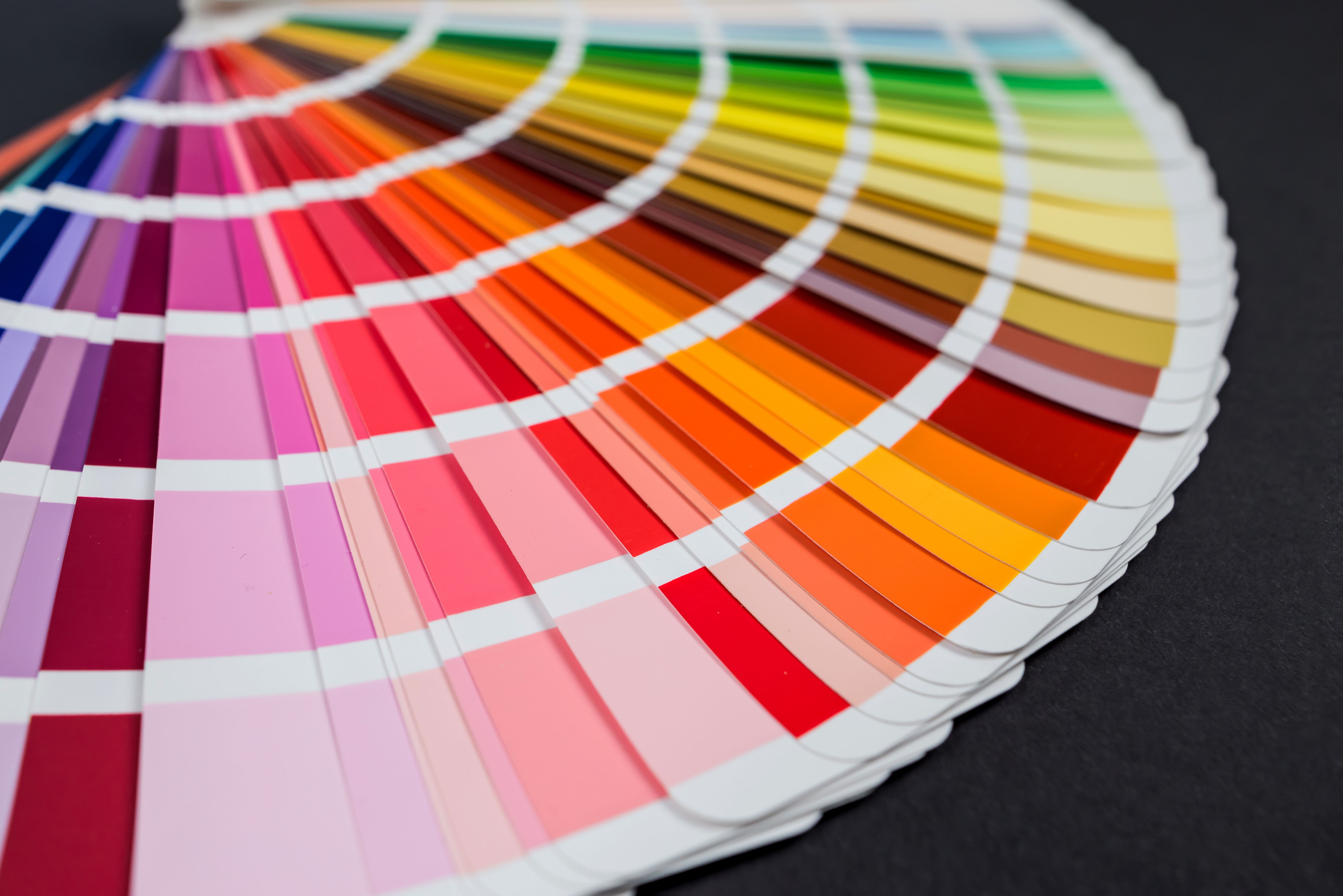
Another common pitfall is selecting too many colors for a single space. While variety can add interest, too much can overwhelm the senses and create a chaotic atmosphere. Stick to a cohesive color palette and use accent colors sparingly to maintain harmony within the room.
Creating a Balanced Palette
To create a balanced color palette, consider the 60-30-10 rule: 60% of the room should be a dominant color, 30% a secondary color, and 10% an accent color. This guideline helps maintain visual balance and ensures that no single shade overwhelms the space.
The Importance of Undertones
Undertones can make or break a color choice. A seemingly neutral beige might have pink undertones that clash with your furniture, or a gray could have blue undertones that make it appear cold. Always check the undertones of a paint color by comparing it with a white sheet of paper and against other colors you plan to use.
Matching Undertones with Surroundings
Once you've identified the undertones, ensure they complement the existing elements in your space. Consider your flooring, furniture, and fixtures to make sure your chosen paint color enhances rather than detracts from your room's overall aesthetic.
The Role of Paint Finish
The finish you select can also impact how a color appears. Glossy finishes reflect more light, making colors appear brighter, while matte finishes can give a more subdued look. Consider the room's purpose and the level of traffic it receives when choosing between finishes like eggshell, satin, or semi-gloss.

Choosing the Right Finish for Each Room
For high-traffic areas like kitchens and bathrooms, opt for a more durable finish like satin or semi-gloss that can withstand frequent cleaning. In contrast, living rooms and bedrooms may benefit from the softer appearance of matte or eggshell finishes.
By avoiding these common mistakes and taking into consideration factors like lighting, undertones, and finishes, you can confidently select paint colors that will enhance your living space and reflect your personal style. Remember that preparation is key; take your time to test and coordinate colors before making a final decision. With these expert tips, you'll be well on your way to creating beautifully painted rooms that you'll love for years to come.